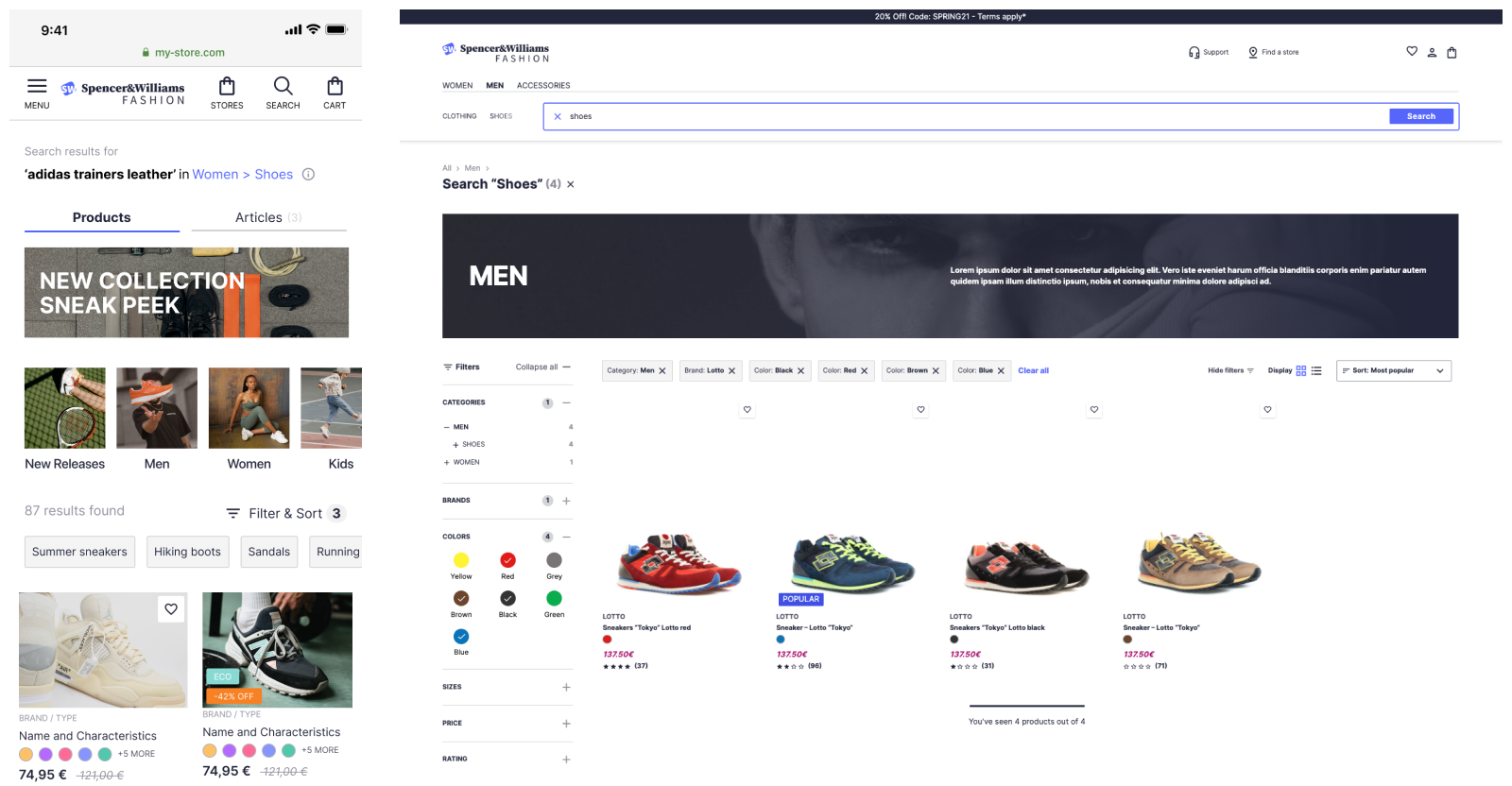
To have a clear end goal for your team, you need to map out exactly what you want your users to see at each
stage of their search journey. There is a large ecosystem of design software—more professional offerings include
Figma and InVision Studio, but you can just as easily use Miro or even a piece of paper. When designing the UX, you
should keep accessibility guidelines in mind. You should also ensure that the experience you are designing keeps
mobile in mind and that your design works well across all screen sizes.
If you’re not sure where to start, check out the Algolia inspiration
library. For e-commerce use cases, you can rely on UI Design Kit for
best practices. It includes predefined yet customizable components and is available in the Figma community.
Each of the sections below details a stage in the user’s journey and includes some questions to ask when
designing.
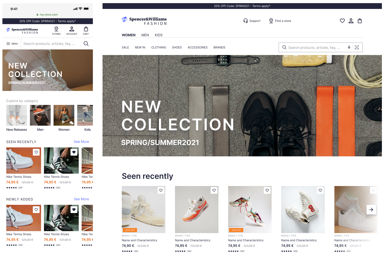
Finding the search bar
The larger the search bar, the higher the engagement. It's always better to present the search bar in a ready-to type
state, not hidden by an icon. Traditionally, users look for search bars in the top right hand corner of the screen.
- Where can the user access the search bar?
- Will this be animated?
- Does the text placeholder tell the user what they can search for?

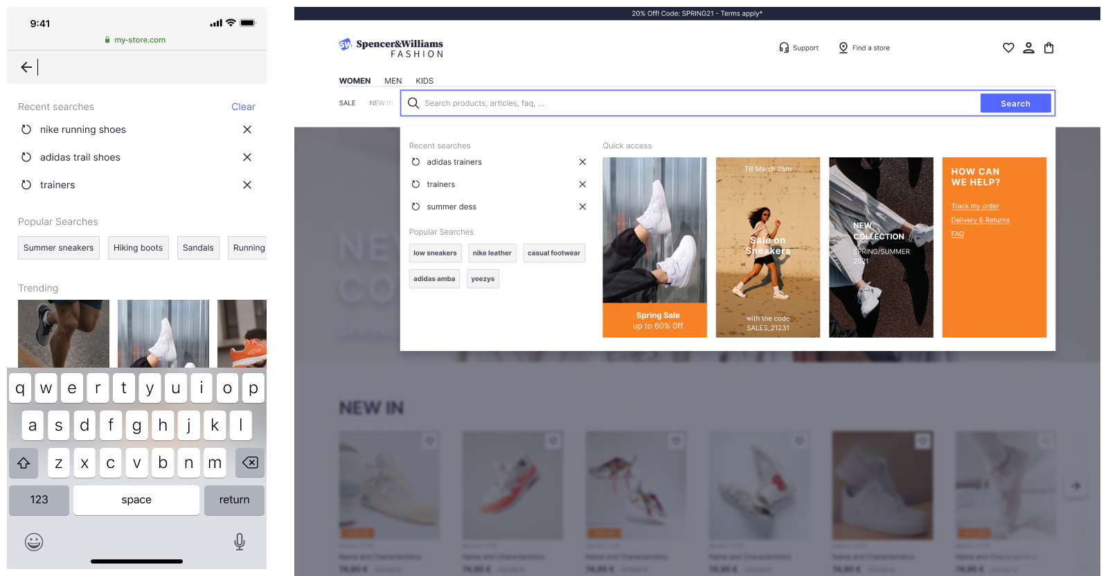
Before performing a search
As soon as users interact with the search bar, they receive feedback. This is the opportunity to provide further
prompts and promotions to your users. It could be in the form of user search history, trending products, or suggest
search terms.
- What happens when the user clicks on the search bar?
- Do you offer recent
searches? (These are offered as a plugin with our autocomplete
library)
- Do you offer the user frequently accessed content?

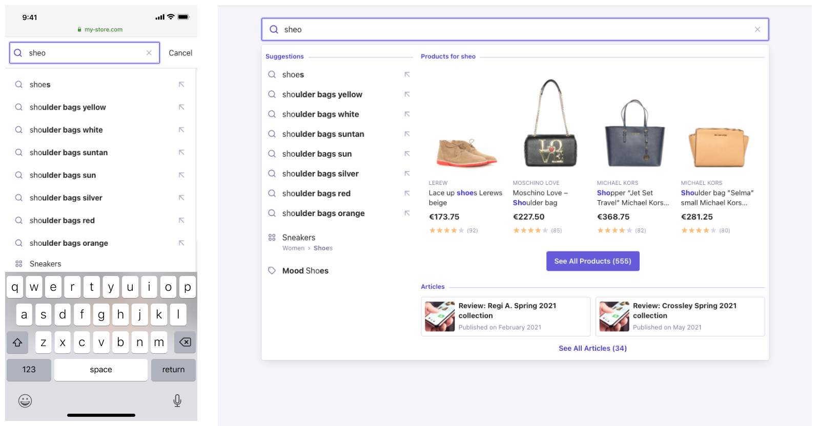
Typing in the search bar
For desktop websites, there are two main patterns that provide users with an as-you-type experience: instant search
and autocomplete.
Instant search puts your results front and center and removes the need for a separate result page. This works
well for results with good visuals and for site search. See this ecommerce example from
our inspiration library.
Autocomplete, in contrast, provides an overlay where you can federate information from multiple sources.
See this
federated search example from our inspiration library.
On mobile, the interaction interface is more prone to error. Query suggestions are the best way to get a user to
results that are relevant to their intent.. They help users type less and get to results more quickly. See this
example from our inspiration
library.
- What happens when the user types in the search bar?
- Have you included query
suggestions? (Algolia offers these out of the box).
- Do you show different types of results in a federated
search?

Search Results Page
For desktop experiences, it’s traditional to find facets on the
left hand side. Over the last few years, fashion retailers have begun to use drop downs above the
results. The latter option reduces engagement but provides more space to display products.
For mobile experiences filters are often in a separate panel.
- How do you display results to the user?
- Do you offer the user facets so they can further refine their search?
- How is each of the facet values be
presented?
- Can a user clear all facet selections at once?
- Are you helping the user easily navigate results, for example by displaying the number of results and
pagination)?
- Do you offer a ‘sort
by’ so a user can sort their results?
- Are you using hierarchical
categorization so the user can easily refine their results?
- Have you checked the widget
showcase to see what’s available?
- Do you want to show banners
on a homepage, search results pages, or category pages ?

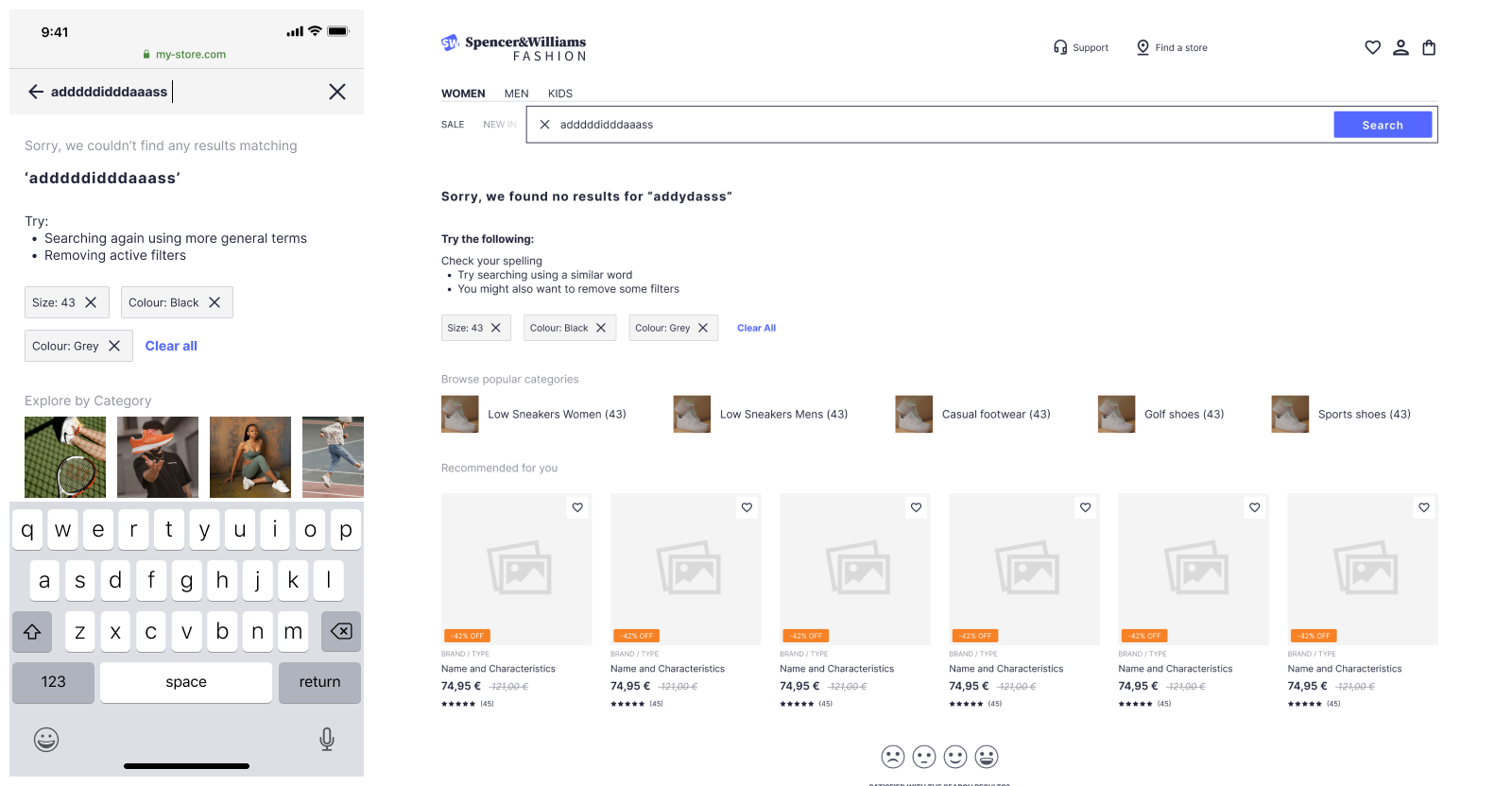
No Results Page
Sometimes users may search for products or content that doesn’t exist in your catalog. Rather than presenting
irrelevant results, it’s best to provide them with a helpful no results page that shows other options for a
continued journey.See this
example of a no results page.
- What do you show to the user when there are no results?
- Are you providing good call-to-actions to keep the user on their journey, for example by showing
bestsellers, other categories, or hints for how to search?
- Is it clear what the query leading to no results is?
