With AI everywhere, we’re getting used to it predicting or completing our thoughts. Autocomplete has been around for over a decade, much longer than AI. It may be more rudimentary, but is one of the first technologies to “read our minds.” Query suggestions are now considered a standard web convention appearing almost everywhere.
Whether you call it autocomplete, predictive search, autosuggest or search-as-you-type, the feature is a mainstay of today’s websites, large and small. Despite its ubiquity, not all sites are leveraging its full power, especially on mobile where speed is key and screen space is limited.
If you’re not sure if you’re maximizing the potential of autocomplete, this blog will get you up to speed. You can also watch my DevCon presentation on this topic here:
Autocomplete: What it is and why it’s essential
Autocomplete is a ubiquitous toolbar search feature that predicts the user’s words and offers search suggestions from the user’s first keystroke.
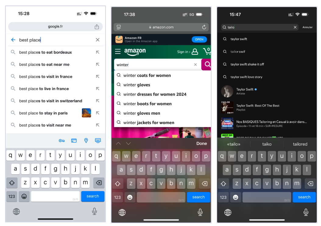
If I enter “best place” on google.fr, a list of potential selections drops down, including “best places to eat in bordeaux” and “best places to visit near me.” If I want to find the best places to visit near me, I can select that option without further typing. Google then uses my geolocation to deliver relevant results. Saving users typing time with autocomplete is a simple and powerful way to drive retention and build conversions.
How autocomplete transforms the mobile experience
Mobile is increasingly where ecommerce research and purchasing happens. Mobile today accounts for 64% of today’s web traffic and 73% of retail traffic.
But typing on smallish mobile phone screens is a chore. Doing it with large fingers, fancy nails or while holding coffee is even tougher. Spelling is another challenge that technology can help circumvent.
To save effort, frustration and time, users now habitually seek autocomplete suggestions after just 1 or 2 characters typed. According to the Baymard Institute, 75% of users seek out suggestions to save time and mental effort.
Reducing mental effort puts users in a better mood to buy and suggestions expose people to search queries products they weren’t aware of, building user interest, and search with greater precision.
Best practices for placing search
It’s not enough to just run autocomplete. Adhering to best practices improves the mobile user experience. Research illustrates that 88% of customers are less likely to return to a site after a poor experience. They’re also 5 times more likely to bounce if the site isn’t optimized for mobile.
Think carefully about screen real estate. The following UX principles gives users the ease and convenience they’re looking for while ensuring optimal design:
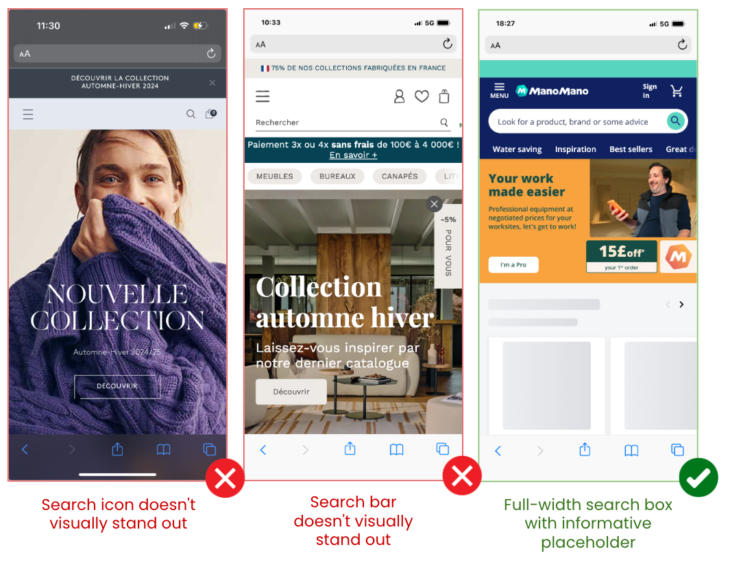
Does your search icon and/or search toolbar stand out? The search box should visually stand out, be full-width and include a placeholder that tells users what to do.
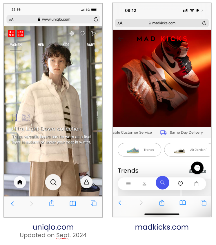
Where is the search on your screen? Don’t leave users searching for search. Put it where people can see it. The Uniqlo and Mad Kicks sites do an excellent job of placing it centrally at the bottom of the screen, within close reach of the thumb. An ideal place for mobile.
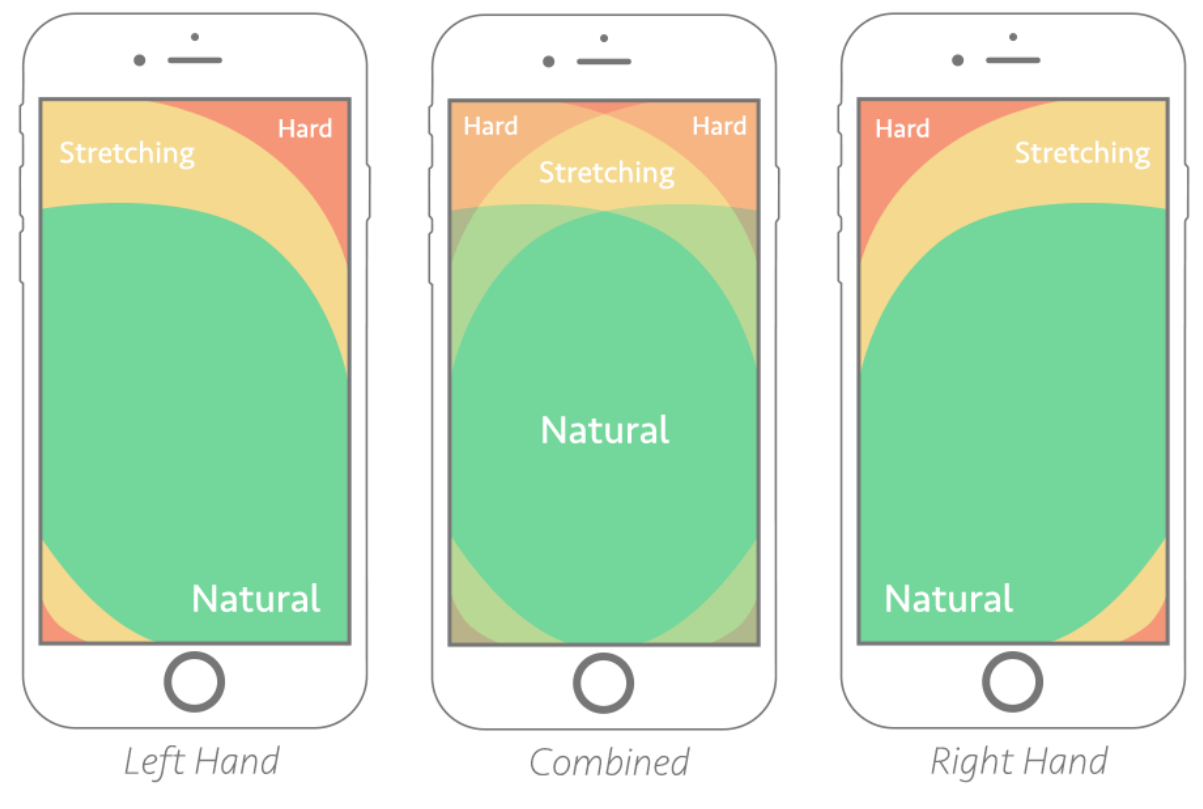
Does search feel natural for right hands, left hands and thumbs? Think about how people use the phone and the various sizes of phones. Best practices dictate that search should be reachable so people don’t have to stretch their fingers too far.
Best practices for autocomplete experience
Autocomplete best practices help guide users and improve discovery. Crafting the right UI can be a gamechanger in delivering an outstanding autocomplete experience. It’s important to consider where and how search happens.
The following UX principles will help you take full advantage of autocomplete:
Are you guiding users with instant and legible query suggestions? Make sure results are returned from the first keystroke for maximum responsiveness and user control.
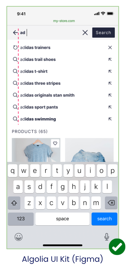
Include 6 to 8 query suggestions. With Algolia’s autocomplete JS, query suggestions will include recent searches.
Prefer “inverted” highlighting. This places in bold the pieces that weren’t typed, focusing user attention on what remains to be read. Also try to maintain vertical alignment, making results easy to scan which reduces mental effort, as in the adidas example below.
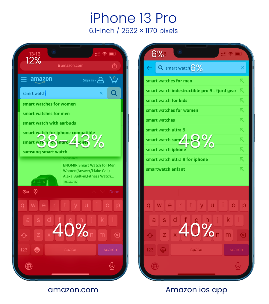
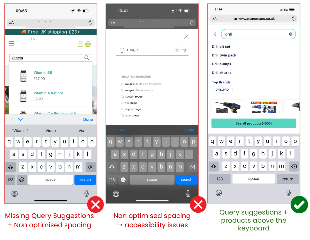
Are you maximizing available space? A frequent problem with search and autocomplete UX is not using screen space effectively. On mobile, there is simply less space to work with. You need to prioritize showing as many products as possible, including when the keyboard is open.
Always test your design on a smartphone to make sure results can be displayed with the keyboard open
Some tips to help you maximize space, as in the pictured examples:
Put the search input at the very top – covering existing banners and headers
Include an “←” arrow so users can close the overlay
Use touch-friendly sizing, a minimum of 14px. Squeezing lines together isn’t a space-saving solution, it makes it hard for users to tap accurately. Use at least a 40 pixel line height.
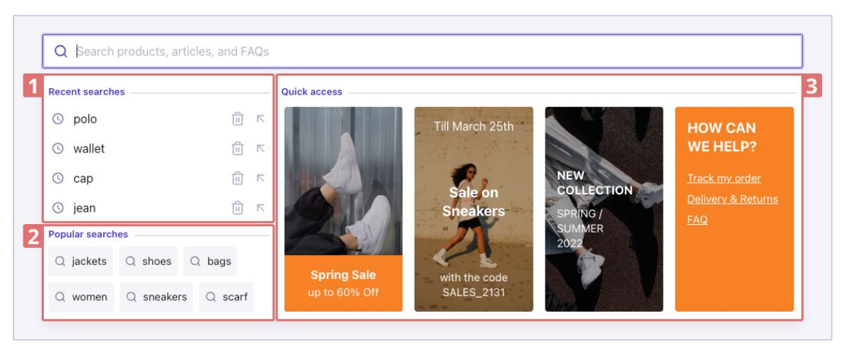
Are you providing an empty query state? This means you’re offering results even before the user starts typing by showing:
Popular searches and other site functionality that inspire first-time site visitors.
Previous searches that help repeat users with the cold start.
Are you providing federated results? Federated autocomplete gives users full exploration power with their fingertips. It not only provides popular search terms, brands and category suggestions, it takes users beyond ecommerce to show non-product content like blogs, FAQ pages and shipping information.
Important: At the same time, make sure you don’t overwhelm the user. Entering more characters will continue to dynamically change the results, but mobile screen space is still limited. Stick to a 5-6 results limit. Again, keeping room for an open keyboard.
Autocomplete beyond search boxes
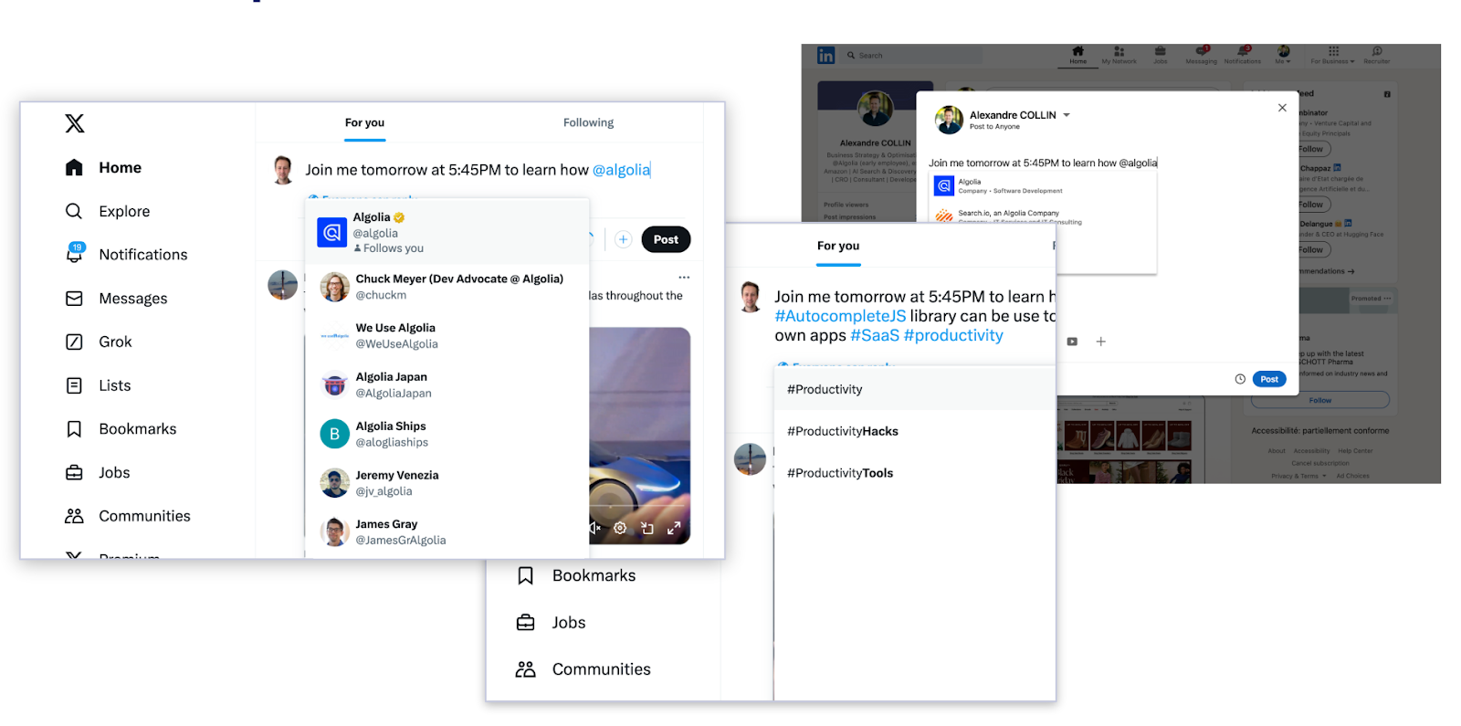
Autocomplete functionality has already spread far beyond the search box, but we often don’t recognize it as autocomplete.
For instance, when you’re writing posts and tweets on social platforms, the “@” and “#” hotkeys often prompt you with suggested user account names or common hashtags to mention and link to your post. Similar to autocomplete, these lists change dynamically as you add keystrokes.
These autocomplete experiences are growing more common in SaaS workplace and productivity platforms, too. Moving beyond people and themes, they let users call up and link to files, pages, calendars, actionable tasks and other content with minimum effort.
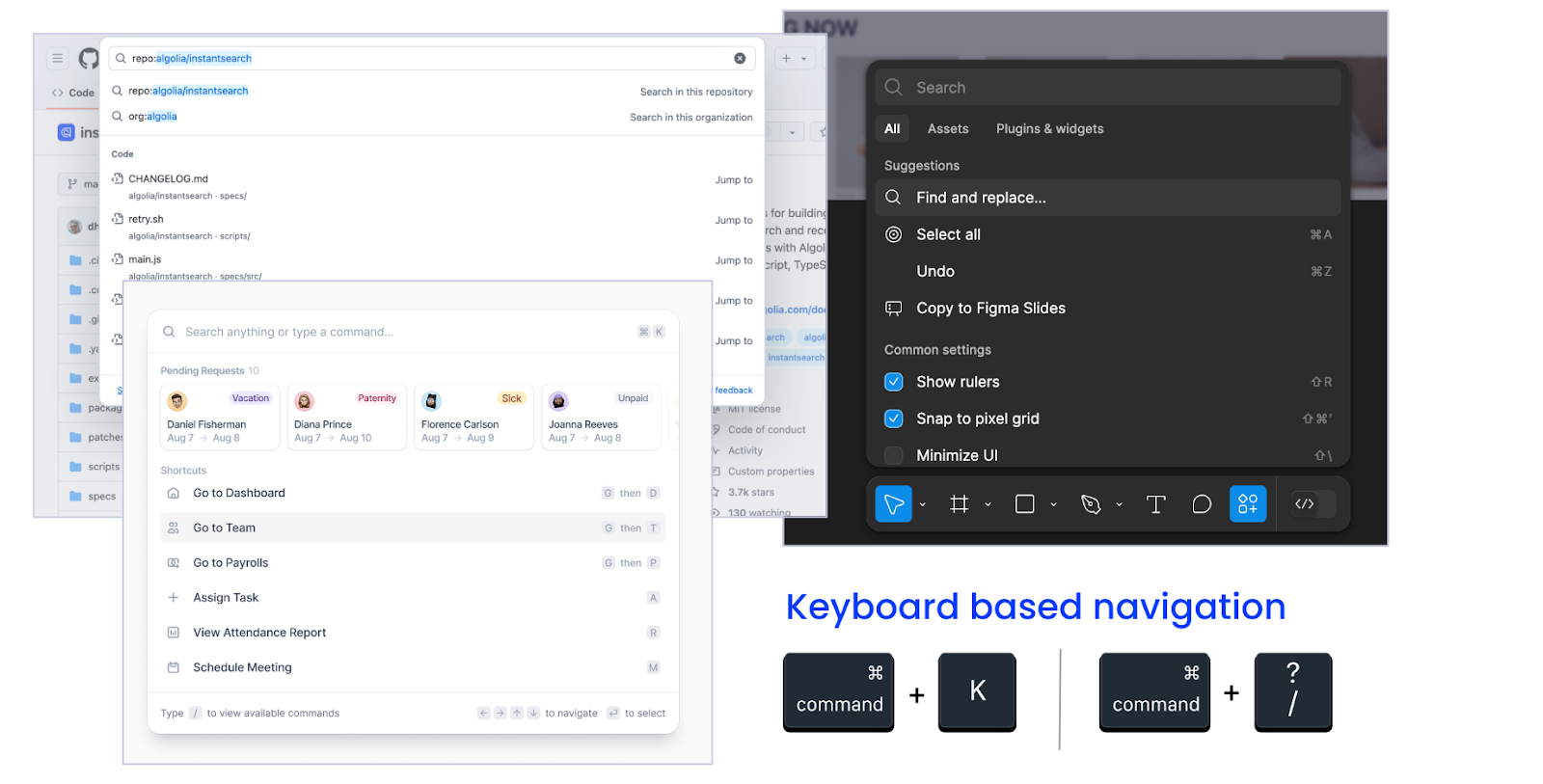
We also see them in command palettes, where a few keystrokes enables maximum autocomplete navigation, such as Spotlight on MacOS. Users increasingly expect to access both content and features from their keyboards using just a few keystrokes with UX-optimized autocomplete.
Optimize for speed
Autocomplete functionality needs to be optimized for speed. Users expect results to be displayed at every keystroke (<200ms). You want to have a back end that delivers on the user end despite low bandwidth. With Algolia’s highly distributed infrastructure, you deliver responses to users in <50ms – matching user expectations, without having to build a complex search stack yourself.
A headless, API-first architecture with low latency lets developers focus on building and testing solutions, leaving connectivity to the API client. Algolia’s dynamic, distributed search network provides >99.99% SLA. Its retry logic architecture switches between servers if one isn’t reachable so your autocomplete function performs without interruption.
Are you using the full potential of autocomplete?
Implementing autocomplete best practices is the best way to make searching and navigating ecommerce sites easy for users on mobile.
Build autocomplete search with screen space, fingers and readability in mind
Provide 6-8 query suggestions in addition to 4-6 results
Leverage the empty query state to give users fast access to content and features
Use federated autocomplete to support non-product content
Enhance other part of your website by leveraging Algolia as you type capabilities on other type of experiences: eg tag boxes, mentions or a command palette
For more information about autocomplete, check out these resources:
 Starten Sie kostenlos
Die weltweit fortschrittlichste KI-Suche
Starten Sie kostenlos
Die weltweit fortschrittlichste KI-Suche AI Browse
Von KI erstellte Kategorie- und Sammlungsseiten
AI Browse
Von KI erstellte Kategorie- und Sammlungsseiten AI Recommendations
Vorschläge überall auf der User Journey
AI Recommendations
Vorschläge überall auf der User Journey Merchandising Studio
Datengestützte Kundenerlebnisse, ohne Code
Merchandising Studio
Datengestützte Kundenerlebnisse, ohne Code Merchandising Studio
Datengestützte Kundenerlebnisse, ohne Code
Merchandising Studio
Datengestützte Kundenerlebnisse, ohne Code Analytics
Alle Ihre Erkenntnisse in einem Dashboard
Analytics
Alle Ihre Erkenntnisse in einem Dashboard UI Components
Pre-built components for custom journeys
UI Components
Pre-built components for custom journeys


%20(2).svg)
