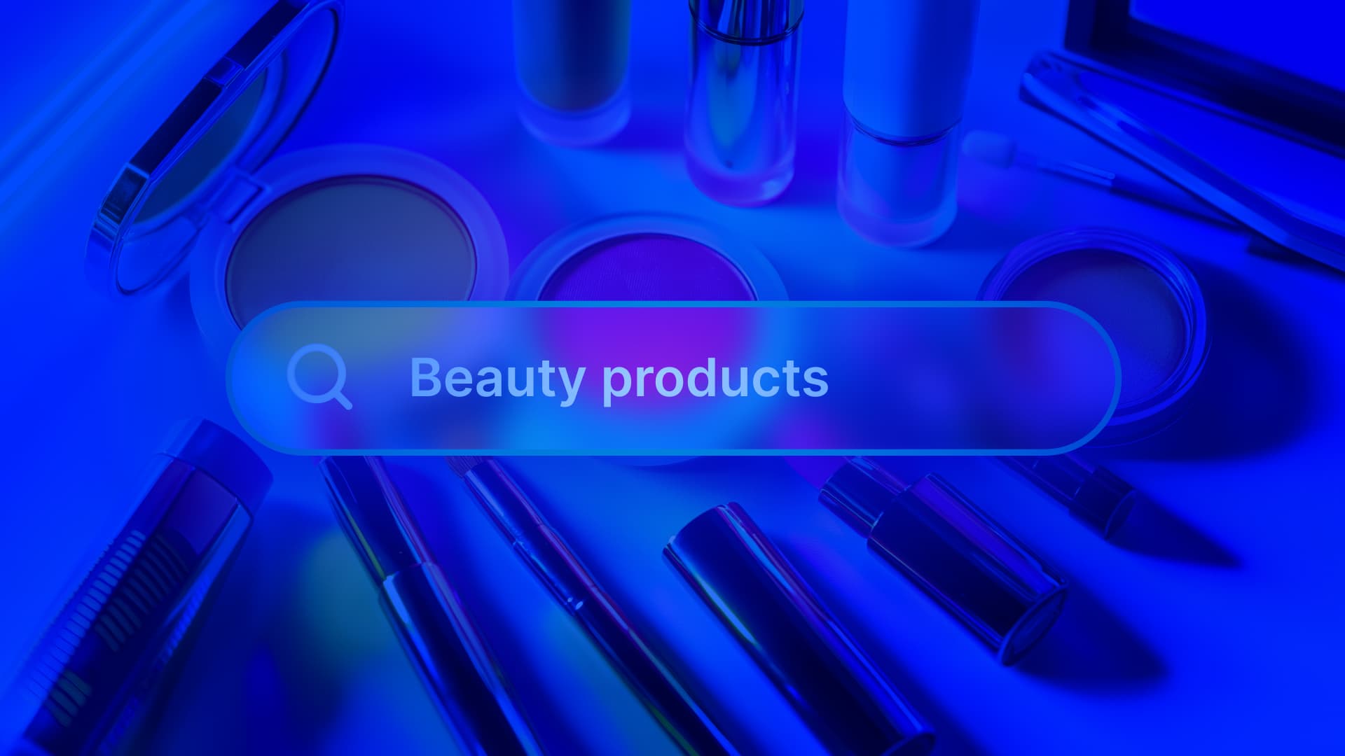
We participated in the WebDev Challenge Season 2, Episode 6, where we took on a novel challenge to redesign the skincare beauty purchasing process with Algolia and Gemini. Most people purchase skincare products the same way: reading a few claims on the label, watching a couple TikTok recs, and relying on a ton of hope. Most of us then flip the bottle over and hit the ingredient list… and realize we didn’t actually know what we were looking at.
That “guesswork” gap—between marketing and meaning—is what pushed us to build a smarter beauty search experience. Something that lets you shop for what you’re actually trying to solve (dryness, dark spots, breakouts), and then explains why a product is recommended in plain language. By solving the problem well, it also saves buyers money because they’re getting the right thing.
The first version took us four hours in the hackathon. The hard part was turning that prototype into something that could be scaled, tuned, and trusted. In this blog, we’ll explain how we went from “it works on demo day” to an MVP anyone can keep building on—with Algolia as the search foundation and Gemini as the “ingredient translator” layer.
We originally presented on this topic together at Algolia DevCon, and you can watch it below.
The problem: Skincare shopping is a search problem (with trust issues)
Most e-commerce search flows assume people know what they want:
-
“face wash”
-
“serum”
-
“moisturizer”
But skincare isn’t really category-first; it’s concern-first. When someone types “dry skin,” they’re not looking for a product type. They’re asking:
-
What ingredients help?
-
Which products actually contain them?
-
What should I watch out for?
-
Can I trust this recommendation?
So we framed the problem like this: We want to help shoppers search by concern, then build confidence with ingredient-level clarity.
The hackathon build: Prove the idea fast
Our hackathon constraint was simple: we had four hours to show the idea was possible. So we made two core bets:
-
Algolia would power the instant, relevant product retrieval
-
Gemini would explain results in a human-friendly way
In practice, that meant:
-
We indexed products (including ingredient lists) in Algolia
-
The user searched for a concern like “dry skin”
-
Algolia returned relevant products immediately
-
Gemini took the top product + ingredients + concern and generated:
Even in a prototype, that combination mattered. Instant results alone are useful—but instant results with explanations are what start to feel trustworthy.
MVP 1.0: Keep the flow tight
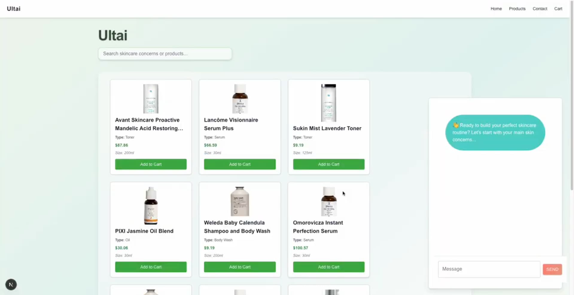
Once we had more time, we tightened the experience into a usable MVP with a few opinionated features:
-
Ingredient lookup (so users can explore “what is this?” on their own terms)
-
An AI chatbot to connect dots across products and routines
-
Basic e-commerce actions like adding items to a cart
We kept Algolia doing what it’s great at — indexing, retrieval, default ranking, and fast iteration via the dashboard. And we used Gemini only where it adds value like translating “ingredient science” into plain English or adding context (benefits, cautions, tips).
This separation is important. If your AI layer becomes your retrieval layer, you can lose determinism and speed fast. We wanted the search experience to stay solid even if the AI layer changes.
MVP 2.0: Move from “results” to “discovery”
MVP 2.0 was about personalization and “discovery” instead of just returning a list.
We leaned into a few Algolia capabilities that made the experience noticeably smarter without forcing us to build a huge backend:
-
Searchable attributes (so concerns and ingredients are first-class search inputs)
-
Synonyms (so beginner language and technical language both work)
-
Ranking + rating logic (so we can prioritize “science, not hype”)
The goal was: regardless of where someone is in their skincare journey, they should be able to search naturally and still get strong results.
We structured search relevance as follows:
Searchable attributes: Concern-first, ingredient-second
We wanted users to search for:
So we made sure those fields were searchable and prioritized correctly. That single decision changes the UX dramatically. You’re no longer forcing users to translate their problem into a product category.
Synonyms: Support beginners and experts at the same time
People don’t all use the same vocabulary. Early on, someone might type “dry skin.” Later, they might type something more technical—like “xeroderma.” By setting up synonyms, we didn’t have to teach users how to search “the right way.” They could search their way and still get relevant products.
Ranking: Prioritize potency, then break ties with ratings
We used a simple philosophy:
-
Prefer products with more active ingredients that address the concern
-
Deprioritize products packed with filler ingredients
-
Use ratings as a tiebreaker when ingredient-based relevance is similar
This is one of those moments where relevance isn’t just “text match.” It’s your product philosophy encoded into ranking. Even if your formula is imperfect at first, having an explicit model makes it easier to iterate—and to explain internally why a search result looks the way it does.
Front-end implementation
We built the UI in React and treated Algolia “hits” (products retrieved by the search engine) as the source of truth for what appears on the page. Two implementation details mattered a lot:
A custom hit grid
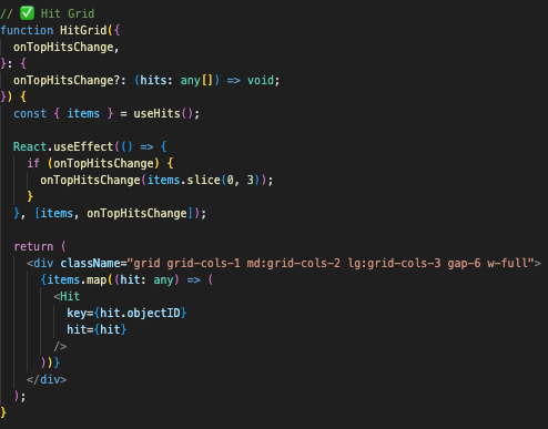
Algolia returns structured data (often JSON-like), but the user needs a clean product grid. We built a grid component that:
-
listens for changes in hits
-
lays out products in a consistent three-column grid
-
updates instantly as filters/search change
The point wasn’t fancy UI—it was predictability. No matter how many results come back, the layout stays stable.
A custom “search bridge” + pagination
We also built a custom search connector so that as the user types, Algolia updates results dynamically—letter by letter. Then we controlled how many hits show per page and wired pagination into the same flow. This is where instant search stops being a feature and becomes a feeling.
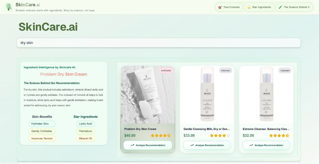
The AI layer: Gemini as the “ingredient translator,” not the search engine
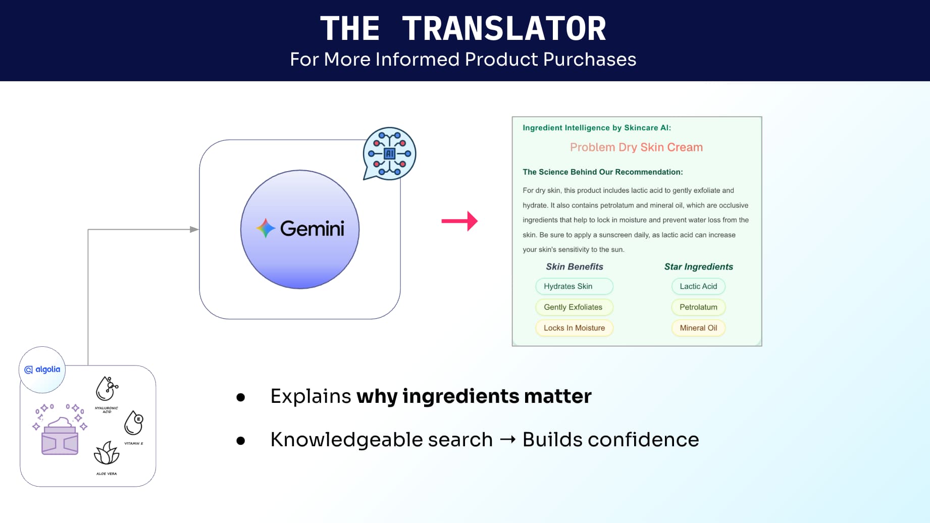
We were careful with how we used Gemini. All products live in Algolia. All retrieval happens through Algolia. Gemini’s job is to answer: “Why did this show up, and how should I use it?” That’s how we generated explanations like which ingredients are relevant to the concern, what the ingredient benefits are, what to be mindful of (for example, reminders around sun sensitivity with certain acids), etc.
Prompting approach: Combine user intent + product ingredients
The basic structure was:
-
user concern (e.g., “dry skin”)
-
product ingredient list
-
guidance structure we wanted back (benefits, star ingredients, cautions, tips)
Gemini already has general knowledge about ingredients (benefits, common side effects, incompatibilities). We used that to produce a clearer explanation layer—without trying to make the model “decide” which products should rank.
What we learned going from prototype to MVP
A hackathon is great for proving an idea. An MVP is about proving you can operate the idea.
Here are the takeaways I’d carry into any search-driven product build:
-
Start with retrieval you can trust. Fast, deterministic search gives you a stable foundation.
-
Make your relevance model reflect your product philosophy. If you care about “science over hype,” encode it.
-
Invest early in synonyms. It’s one of the cheapest ways to expand “who your product works for.”
-
Treat AI as an explanation layer first. Explanations build trust—and are easier to iterate than core retrieval.
-
Use the dashboard to iterate quickly. If tuning relevance requires code deploys, you’ll tune less.
-
Design for clarity, not just convenience. “Why this result?” is a product feature, not a tooltip.
-
Scalability is a UX feature. Speed, consistency, and predictable results are what make personalization feel real.
If you’re building something similar
If you’re working on search or recommendations—especially in domains where people don’t speak the taxonomy (beauty, wellness, healthcare, finance)—the pattern that worked for us is:
-
Algolia for fast, configurable retrieval
-
A lightweight AI layer for explanation and guidance
-
A UX that prioritizes trust and clarity, not just conversion
That combination is what took us from a four-hour demo to an MVP we can keep improving—without rebuilding the whole stack every time we learn something new.
You can check out the demo on https://syscily.com/#projects.


%20(2).svg)
